TL;DR

Get home appliances delivered free with Prime
- Fast, free delivery on millions of items
- Prime Video, Amazon Music and more included
- Member-only deals all year
Interior designers interviewed by House Beautiful describe growing interest in red kitchens as homeowners seek more color than the familiar neutral palette. They recommend choosing a red that suits the room and balancing it with warm neutrals, natural materials and texture; the report does not establish how widespread the shift is.
Interior designers are increasingly considering red kitchens as an alternative to the whites, creams and ivories long common in kitchen design, according to a report by House Beautiful. The shift reflects some designers’ view that homeowners want more personality at home, though the report offers examples and expert opinions rather than data showing how widespread the trend is.
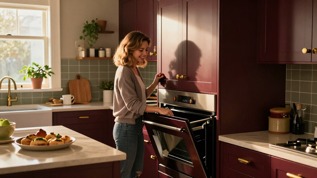
The designers quoted in the report describe a range of reds, from deep burgundy and brick to brighter cherry and tomato tones. British interior designer Uns Hobbs says some people have grown tired of playing it safe and want more personality in their homes. She favors deeper reds for a traditional look, and used deVOL’s Refectory Red in her own kitchen.
Kevin Lichten of New York’s Lichten Architects says the color can make a strong visual statement. In one project, he used red on lower cabinetry and paired it with gray upper cabinets, which he said helped balance the color. In another home, he selected Benjamin Moore’s Red Parrot, which he described as earthier than an artificial-looking bright red.
Aria Jahanshahi of Opa Architecture sees the kitchen as more than a place to cook: he says it also serves as a gathering space for family life. An Opa-designed city apartment featured in the report uses Benjamin Moore’s Classic Burgundy on a peninsula. The designers’ examples show ways to introduce red, but they do not establish a sales trend or measure how many homeowners are changing their kitchens.
Why Red Changes a Kitchen
A kitchen color choice affects a large, frequently used room, and red is visually more assertive than the neutral shades many homeowners have relied on. For people planning a renovation or repaint, the designers’ advice offers a practical distinction: a bold color need not cover every surface. Cabinet fronts, a peninsula or a smaller accent can bring red into the room while leaving other areas quieter.
The shift also reflects a broader design tension between resale-minded restraint and personal expression, though the source does not quantify either preference. A red kitchen may feel welcoming and distinctive to one household, while being too intense for another. The report’s central point is not that red is right for every home, but that designers are treating it as a serious option rather than dismissing it as impractical or dated.
As an affiliate, we earn on qualifying purchases.
From Neutral to More Personal
White, cream and ivory have been familiar choices for kitchens, in part because they offer a relatively restrained backdrop for cabinets, appliances and finishes. House Beautiful’s report says some designers now see those colors as tired, but that description is an attributed assessment, not an industry-wide finding. It gives no survey results, market figures or sales data to show a broad move away from neutrals.
The designers point to different reasons for using red. Lichten describes it as a forceful visual choice; Jahanshahi frames a more colorful kitchen as part of the home’s role as a social hub. The report also mentions the association between red and appetite, including its use in fast-food branding, but Jahanshahi cautions against reducing the kitchen trend to that explanation. He argues that kitchens increasingly support conversation and family routines alongside cooking.
“People have become a little bored with playing it safe and want more personality in their homes.”
— Uns Hobbs, British interior designer
How Broad Is the Shift?
The report does not provide survey data, renovation figures or paint sales establishing that homeowners broadly are replacing neutral kitchens with red. Its evidence consists of interviews with designers and photographs of selected projects. It is also unclear whether the examples reflect a short-lived style moment, a lasting change in client preferences or a trend concentrated among particular designers and homeowners.
Red’s appearance can vary by shade, finish, lighting and surrounding materials. The article offers designers’ recommendations, not a tested formula or a guarantee that a given color will suit every kitchen. Homeowners’ budgets, existing cabinetry and plans to sell are not addressed in detail.
How Designers Apply the Color
The report describes practical ways designers are using red: start with a smaller area, consider deeper or earthier shades, and balance the color with warm neutrals, gray, stone, brass, wood or ceramics. Texture and supporting finishes can soften the effect. Those are design recommendations from the interviewees, not requirements or evidence that one palette performs better than another.
For homeowners weighing the look, the next step is to test colors in the actual room and view them under its lighting before committing to cabinets or paint. Whether red becomes more common will depend on future projects and consumer choices; the source provides no timetable or forecast for that change.
Key Questions
Are designers replacing neutral kitchens with red?
Some designers interviewed by House Beautiful say they are considering red as an alternative to neutral schemes. The report does not include market data showing that red is replacing neutrals across the wider housing or design industry.
Which red shades do the designers recommend?
Uns Hobbs prefers deeper reds such as burgundy for a traditional look. Kevin Lichten says brighter shades can work if they do not look artificial, and points to an earthier red used in one project.
How can red be used without overwhelming a kitchen?
The designers suggest controlling the amount of red, using it on a feature such as a peninsula or lower cabinets, and balancing it with quieter colors and varied materials. Gray cabinetry, warm neutrals, wood, stone and texture are among the examples they discuss.
Is the red-kitchen trend linked to appetite?
The report notes that red is associated with appetite and appears in some fast-food branding. Jahanshahi argues that the kitchen’s role as a gathering space is a more relevant explanation for using a warm, vibrant color; the report does not establish a direct cause for the trend.
Source: rss
Cold & flu season Picks
humidifiers
As an affiliate, we earn on qualifying purchases.